Jan 16, 2014

PIL -> Pillow

Pillow is a PIL fork created to add new features. setuptools support was also added. A more frequent release cycle was also promised. With Pillow you can have PIL as a package dependency in setuptools and virtualenv. That means less clutter and robustness for the development. :-)

Pillow allows you to continue to use import PIL , so there is no need to change your current PIL related code. 0 migration overhead.

Archlinux already dropped support for PIL in favor of Pillow.

TL;DR PIL > Pillow

Jan 13, 2014

Reload and unload modules in Python

# python 2.7
import math

reload(math) # or import math again to reload the module
del(math) # unload module

# python 3.x
import math

# the reload function was eliminated on python 3
import math # or use exec("import math")
del(math) # remove module

Jan 9, 2014

Python cookbook: get the file dir path

import os
os.path.dirname(os.path.abspath(__file__))

Jan 7, 2014

Regex like operators for DCG

Today I was trying to create a simple parser to count syllables in latin words with Prolog. I usually use DCGs in Prolog for parsing. Their semantic is very similar to BNF . I love DCGs, but sometimes the verbosity in some cases annoys me. Take the following example:

consonant -->
    "b"; "c"; "d"; "f"; "g"; "h"; "l"; "j"; "k"; "m";
    "n"; "p"; "q"; "r"; "s"; "t"; "v"; "x"; "z".
consonants -->
    [].
consonants -->
    consonant, consonants.

vowel -->
    "a"; "e"; "i"; "o"; "u".
vowels -->
    vowel.
vowels -->
    vowel, vowels.

syllable -->
    vowels.
syllable -->
    consonants, vowels.

syllables(0) -->
    [].
syllables(N) -->
    syllable, syllables(N_1),
    { N is N_1 + 1 }.

The vowels and consonant rules were created merely as helpers for the syllable predicate. That could be reduced if I had regex operators like +, * or ?. Although there are modules for using regex in Prolog ( swi-regex ), it is not suitable when using within in DCGs. So I wrote these regex like operators, with meta DCG predicates, for DCG (like EBNF operators):

% op statements let me use them without parenthesis
:- op(100, xf, *).
:- op(100, xf, +).
:- op(100, xf, ?).

*(_) -->
    [].
*(EXPR) -->
    EXPR, *(EXPR).

+(EXPR) -->
    EXPR.
+(EXPR) -->
    EXPR, +(EXPR).

?(EXPR) -->
    [].
?(EXPR) -->
    EXPR.

They allow me to modify the times a given rule will be matched. So, I can replace this:

consonants -->
    [].
consonants -->
    consonant, consonants.

vowels -->
    vowel.
vowels -->
    vowel, vowels.

syllable -->
    vowels.
syllable -->
    consonants, vowels.

with a simpler version without intermediate rules (using the operators definition through a library):

syllable -->
    *consonant, +vowel.

Dec 27, 2013

Improve your lazy debugging in C++

Are you too lazy to learn your debugger? When debugging, I usually want to know if some code section is reached.

I can do this:


void foobar() {
    printf("foobar()\n");
    // ... do foobar
}

But I should use cout instead printf in C++ . printf is faster, but in this case it should be irrelevant. So I have:


void foobar() {
    std::cout << "foobar()" << std::endl;
    // ... do foobar
}

I could also use GCC's function name macro __PRETTY_FUNCTION__ and __LINE__ macro to identify the reached code section easier.


void foobar() {
    std::cout <<  __PRETTY_FUNCTION__ << " at line " <<  __LINE__ << std::endl;
    // ... do foobar
}

Add that on a macro to reuse it:


#if DEBUG
#include 
#define REACH std::cout <<  __PRETTY_FUNCTION__ << " at line " <<  __LINE__ << std::endl;
#endif

void foobar() {
    REACH
    // ... do foobar
}

And happy debugging!

Not.

Dec 19, 2013

How to set a X window visible or invisible using Xlib


bool m_visible;
Display* m_display;
Window m_window;

void setVisible(bool visible)
{
    if (visible == m_visible)
        return;

    if (visible)
        XMapWindow(m_display, m_window);
    else
        XUnmapWindow(m_display, m_window);

    m_visible = visible;
}

Oct 3, 2013

Functional Pattern Matching with Python

This talk as given at Python Brasil 2013, at Brasília.

Aug 23, 2013

Jun 11, 2013

Nix

For the last few months my team (OpenBossa) at INDT (Instituto Nokia de Tecnologia) have been working on WebKitNix (Nix for short). WebKitNix is a new WebKit2 port, fully based on POSIX and OpenGL. We also use CMake build system (like GTK and Efl), GLib, libsoup (networking) and Cairo (2D graphics) as dependencies. It also uses Coordinated Graphics and Tiled Backing Store from WebKit2. Many of its building blocks are shared with others ports already on trunk.

The Nix port offers a C API for rendering a WebView within a OpenGL context, based on WebKit2 API. You can use Nix to create applications such as a web browser or a web runtime. WebKit2 run the context for each web page in a different process. This process isolation keeps the UI responsive, with smooth animations and scrolling, because it does not get blocked by Javascript execution.

We want to ease the work of Consumer Electronics developers who wants to have a web runtime in their platform, without the need to create another WebKit port. That is why Nix has less dependencies than Efl, GTK or Qt, which should also be ported to the target platform.

Nix API also enables the application to interact with the Javascript context. So it is possible to add new APIs, to handle application specific features.

How did it started?

The OpenBossa team used to maintain the Qt WebKit port for years, helping Nokia/Trolltech. But then, in the last years, from the experience gathered with the Snowshoe browser, handling with dependencies (such as QtNetwork) that were much bigger than we really needed. We tried to replace some dependencies of QtWebKit and later Efl to see how minimal WebKit could be. So we took some steps:

  1. Initial idea: platform/posix or platform/glib (share code)
  2. Ivolved problem: we wanted to have different behaviors for QQuickWebView -> Qt Raw WebView
  3. Network: QtWebKit + Soup experiment
  4. Efl Raw WebView experiment
  5. Efl Without Efl :-)
  6. Nix

How to use it?

When you compile Nix source code you can run the MiniBrowser to test it:

$ $WEBKITOUTPUTDIR/Release/bin/MiniBrowser http://maps.nokia.com

MiniBrowser code

The Nix-Demos repository offers some example code, including a Glut based browser and minimal Python bindings for Nix: https://github.com/WebKitNix/nix-demos.

On Nix-Demos we also have a Nix view, using only a DispmanX and OpenGL ES 2 working on the Raspberry Pi. To compile this demo, you will need our RaspberryPi SDK .

There is even a browser with its UI written in HTML: Drowser

Feel free to contact us on #webkitnix at freenode.

Roadmap

Our plan is to upstream Nix in WebKit trunk by June/2013. Then, keep the maintainence and focus on the web platform, including some new HTML5 features, such as WebRTC.

May 30, 2013

Why is Python slow? Python Nordeste 2013

It was a great event! Thanks to everyone who made it happen.

Dec 12, 2012

OpenGL Lesson 02 - Drawing with OpenGL

OpenGL is a primarily an C API, for drawing graphics. Implementations and bindings exists for several languages such as Java, Python, Ruby and Objective C. OpenGL became the standard drawing API supported by most modern device with graphics, independent from vendor, operational system, or if it is desktop or embedded. Of course the platform matters, but we can split the platform dependent code from pure OpenGL.

OpenGL became a standard mainly due to its rendering pipeline, which is trivially parallelized. This allowed the creation of specialized hardware, the well known graphics cards. These cards became very small and started to be practical shipping embedded devices with them. Now high performance graphics in these devices are a reality.

On traditional desktop platforms, the usual layout of graphics card stand as pictured below. In this scenario, moving data to and from the card can mean a huge cost. On others platforms, such as the mobile, its common that GPUs uses the same memory as the CPU. However, the programmer still needs to handle this memory efficiently.

For this new range of devices, the Khronos (group responsible for standardizing OpenGL API) released an OpengGL specification focused on embedded systems, the OpenGL ES.

In this post I would like to explain some key concepts about the OpenGL API:

  • What are the best practices for it.
  • Differences between the "Desktop" version versus the ES version.
I want not to go deep in the API or its functionalities. You have other sources that covers them better. I recommend the ones used as reference for this post:

Hello Triangle!

Enough talking, show me the code! I wrote the following code using GLUT and OpenGL 1. GLUT is a simple toolkit to create simple OpenGL applications. It basically opens an window with a GL context, and handles primitive mouse and keyboard events.

#include <GL/gl.h>
#include <GL/glut.h>

void display()
{
    glClear(GL_COLOR_BUFFER_BIT); // Clean up the canvas

    glBegin(GL_TRIANGLES);
    glVertex2f(-1.0f, -1.0f);
    glVertex2f( 0.0f,  1.0f);
    glVertex2f( 1.0f, -1.0f);
    glEnd();

    glFlush(); // Forces previous GL commands to be send to the GPU
}

int main(int argc, char **argv)
{
    glutInit(&argc, argv);
    glutInitWindowSize(480, 480);
    glutCreateWindow("Hello World");

    glutDisplayFunc(display);

    glutMainLoop();

    return 0;
}

Drawing the triagle

In OpenGL 1 and 2, the easiest way for you to draw a triangle, is using some form of glVertex*. These call must be enclosed between glBegin and glEnd.

OpengGL uses a coordinate system where the origin is the center of the viewport, the X axis has left to right orientation and Y axis is bottom to top, as pictured below. By default everything between (-1, -1) and (1, 1) is what youll be shown in the viewport. Check this tutorial for understanding OpengGL coordinate system and camera deeper.

You also need to assert what kind of primitive you are passing to OpenGL. It accepts the primitives illustrated below with their correspondent constants. OpenGL ES does not support polygon or quads, you will need to assemble them yourself.

Interleaved with the vertex position, you can add other information such as colors, texture coordinates, normal direction. You can define other vertex attributes for richer shaders. Shader is a piece of code that defines how your primitives will be rendered. With them is possible to make a lot of effects such as normal mapping, adding shadows, particles and many more. When we choose a shading model we are using OpengGL default shaders. Standard OpengGL defines a large set of inputs and outputs a shader must have. OpenGL ES 2 and above does not defines what you must enter as input for the shaders. Is up to the programmer what will be the inputs vertex shader will have. The contract assumes that the vertex shader will return at least a position (search for gl_Position) and the fragment shader a color (gl_FragColor). Do not worry. This will be further detailed in a following post.

Vertex Arrays

Drawing with glVertex* was deprecated from OpenGL 3 and beyond. In OpenGL ES we do not have them either. This drawing method overheads of one function call for each information entered in the pipeline. The OpengGL comittee also wanted to disencourage the usage of this kind of input mode. The interfere of this overhead is small for small objects, but is not true for large ones. Another reason, for removing them (specially on ES version), was the make OpenGL implementation lighter, by reducing the number of internal states.

Prefere to draw using vertex arrays. Vertex arrays are arrays that each element contains all the vertex information. The command to draw them is glDrawArrays . Indexes can be specified to reuse the vertex definition by using glDrawElements. A good reference for this subject is this one . As this is the standard way when using OpenGL ES 2, I will give an example.

Example of Vertex Arrays

To draw a square you must first define the schema of each vertex. Here, each vertex has a position (3 floats) and a color (3 floats for R, G and B color channels). In C I like to define a struct to improve readability:

struct vertex_t {
    GLfloat position[3];
    GLfloat color[3];
};

void display()
{
    struct vertex_t vertex_data[] = {
         {{-1.0f, -1.0f, 0.0f}, {1.0f, 0.0f, 0.0f}}, // red bottom left
         {{-1.0f,  1.0f, 0.0f}, {0.0f, 1.0f, 0.0f}}, // green top left 
         {{ 1.0f, -1.0f, 0.0f}, {0.0f, 0.0f, 1.0f}}, // blue bottom right
         {{ 1.0f,  1.0f, 0.0f}, {1.0f, 1.0f, 1.0f}}, // white top right
    };
    
    // ...
}

It is possible to have different arrays for color and position, but for speeding up the shader execution is recommended to keep information about the same vertex contiguous to use memory locality.

glVertexAttribPointer(
    position_attribute_location, // attribute description (depends on the shader)
    3, // size of the information (3 coordinates in this case)
    GL_FLOAT, // type of the information
    GL_FALSE, // if the value will be normalized (for vectors)
    sizeof(struct vertex_t), // stride of the memory vector
    &vertex_data[0].position // initial address
);
// asserting that position will be used by the shader
glEnableVertexAttribArray(position_attribute_location); 

glVertexAttribPointer(
    color_attribute_location,
    3,
    GL_FLOAT,
    GL_FALSE,
    sizeof(struct vertex_t),
    &vertex_data[0].color
);
// asserting that color will be used by the shader
glEnableVertexAttribArray(color_attribute_location);

// Draw a triangle strip vertex from the current attribute pointers
// starting on index 0 and using 4 elements
glDrawArrays(GL_TRIANGLE_STRIP, 0, 4);

This gives us the following result:

Notice that the colors for each vertex stands as the ones we gave, but all the region in between has the color calculated as the interpolation of the vertex colors. The rasterizer is the responsible for doing this.

You could also use indexes to access the vertex. For bigger elements it may be a better solution, specially for 3D objects, because you can share vertex that appears in multiple polygons of an object. Using index would speed up the memory transfer and usage for these objects.


GLubyte indices[] = {
    0, 1, 2, // first triangle
    1, 2, 3  // second triangle
};

glDrawElements(
    GL_TRIANGLES, // not a strip in this case
    6, // number of indexes
    GL_UNSIGNED_BYTE, // type of the indexes
    indices // a pointer to indexes themselves
);

The previous code does it for a trivial shader set (called a program). I will not explain how to use it here because is out of the scope for this lesson. On regular OpenGL versions you could use glVertexPointer and glColorPointer. I will left it as an exercise for you.

Vertex Buffer Objects

Buffers are objects that stores vertex information in GPU memory. It is a must for improving the performance when drawing large objects. In heavy application such as games or CADs, is good to remove the overhead of from sending vertex data from regular memory to graphics card memory by pre loading the vertex data in a buffer. The code below show how can you upload the vertex data to a buffer.

GLuint bufferId;

// here you get handlers for GPU buffers, in this case, only one
glGenBuffers(1, &bufferId);

// asserts that you are using the buffer represented by bufferId
// as the current ARRAY_BUFFER
glBindBuffer(GL_ARRAY_BUFFER, bufferId);

glBufferData(
    GL_ARRAY_BUFFER, // the data is uploaded to current array buffer
    sizeof(vertex_data), // number of bytes of the total array
    vertex_data, // the pointer to the data
    GL_STATIC_DRAW, // hint of how the buffer will be used, in this case, data will not change
)

To draw the buffer content, you must use glVertexAttribPointer passing the buffer offset instead of the vertex_data address. OpenGL will notice that a buffer is bound and will use it.

glBindBuffer(GL_ARRAY_BUFFER, bufferId); // Bind whenever you will use it

glVertexAttribPointer(
    position_attribute_location, // attribute description (depends on the shader)
    3, // size of the information (3 coordinates in this case)
    GL_FLOAT, // type of the information
    GL_FALSE, // if the value will be normalized (for vectors)
    sizeof(struct vertex_t), // stride of the vertex buffer data
    0 // offset at buffer
);
// asserting that position will be used by the shader
glEnableVertexAttribArray(position_attribute_location); 

glVertexAttribPointer(
    color_attribute_location,
    3,
    GL_FLOAT,
    GL_FALSE,
    sizeof(struct vertex_t),
    3 // offset at buffer
);
// asserting that color will be used by the shader
glEnableVertexAttribArray(color_attribute_location);

// Draw a triangle strip vertex from the current attribute pointers
// starting on index 0 and using 4 elements
glDrawArrays(GL_TRIANGLE_STRIP, 0, 4);

// Unbinds the buffer
glBindBuffer(GL_ARRAY_BUFFER, 0);

Remarks about OpengGL ES 2

OpenGL ES 2 does not have the model-view matrix, responsible for setting the camera view, nor the matrix stack. All you have is the X axis [-1.0, -1.0] to Y axis [1.0, 1.0] region which will be mapped to the viewport. If you need those features (you will for most 3d applications) you will have to handle them inside your application code. You will have to do it yourself by exporting a model-view in the vertex shader as an uniform variable. For a theorical background on it, check my previous lesson . A great tutorial on how to play with the camera, transformations and model coordinates is this . It explains a bit how it works under the hood for regular OpenGL. Its worthy to take a look.

While hacking some examples I have come to some weird behaviour in OpenGL ES 2.0 for the Raspberry Pi. It might be bugs or mine misinterpretation.

  • glUniformMatrix4fv translate parameter must be false. It simply does not work otherwise.
  • glDrawElements did not worked with unsigned int.

Nov 23, 2012

Raspberry + Python at Python Brasil [8]

This is the presentation given at Python Brasil [8], in Rio de Janeiro. I hope you like it. :-)

Nov 19, 2012

OpenGL Lesson 01 - Pre OpenGL

This slides are from a lecture about OpenGL I'm giving at INDT. The first lesson was to refresh some important math concepts that will be important to understand how OpenGL works under the hood.

The slides are simply pictures of the board. Yes, they are in portuguese.

Feel free to make a question in the comments.

Aug 13, 2012

Qt & KDE in FISL 13

Last month, the 13rd FISL (Free Software International Forum) happened in Porto Alegre , in the very south of Brazil. It was a great opportunity to see what's going on in the free software community besides Qt and KDE in Brazil.

It was a great to see again some friends from KDE Brazil and met some new ones. The Konqui

I also gave some talks and workshop about Qt, KDE and game development.

Workshop: Developing applications for multiple devices using Plasma technologies

This workshop was idealized and given by Sebas , and I was there for helping him, specially with the language barrier. In the workshop, QML was introduced together with KDE libs and what they can add to the applications.

Was good to show the current state of the Plasmate and how easily is creating and deploying a new Plasmoid. It was interesting to see how people were amazed about how easy is to start hacking and deploying a project.

This is the slide we used during the workshop:

Talk: Games with Qt

In this talk I gave an overview about what Qt is and which tool are available for creating games with it.

Workshop: Games with Qt

On the third day I gave a 3 hours hands-on workshop about game development using only QtQuick. During the workshop, I've presented basic QtQuick and some basic game concepts such as the game loop, collisions and physics. I also tried to apply to explain how these concepts match with the QML development.

I created a simple click game Monera as an example to the attendees. The code was written step by step and used itself as example and introduction to QtQuick. It was possible for everyone to write the code on their own computers and test.

In the end also gave them a overview about how to install the QML-Box2D and how to use it's API.

The code used as case is available on GitHub: https://github.com/dakerfp/Monera-Game

Unfortunately I didn't used git to keep the history of steps, modularization and refactoring I did during the workshop. I think that would be a plus to understand the code and how we came to it.

This was my first time on FISL and it was great! And I expect that won't be my last.

Jun 16, 2012

Akademy 2012

Hey folks, I'm going to Akademy!


Me and Thiago are going to present about Qt Components & Qt Styles in Qt5.
I hope to see you in Tallinn!


May 14, 2012

QML Theming/Styling (Update)

This post is an update about the research project from my team, described a few weeks ago.

From the time we published the last post about QML Styling until now we have worked on this set of issues/features:

  • Get feedback about research project
  • Combo Box Component
  • Combo Box Customizable Style
  • Combo Box Plastique Style
  • SubControl Styling
  • Understand SceneGraph internals
  • Understand other native platform internals
I will detail what was possible to make for each of these topics in sessions below.

What is our vision now?

Last week, we have read a few blog posts, and talked with a few Qt & KDE application developers about what should be the priorities for creating desktop and mobile applications. I have presented our proposed solution for using native look and feel for QML widgets, how to create custom styles from scratch, using the CustomStyles helper, and how to apply them with the ApplicationStyle API.

Based on the feedback and the blog posts, my team sat down and came with the following set of statements which summarize our vision for what sould be our focus of our current research:

  1. Usable QML components with native styles working ASAP
  2. Developers want to code entire application UI with QML having native look and feel.
  3. Easy customization
  4. It's all about making easier to create components with different look only by filling in some templates to avoid code repetition for standard. These custom styles are targeted to be like a short cut, obviously for more complex behaviour, you will need to create your own style.
  5. Powerful customization
  6. Enabling to use QtQuick components as the style can make widgets look fluid. It's desirable that the new styling mechanism is at least as powerful as QStyle is today. As a first shot we want to enable styling do at least what QtWidgets style does. The main point here is to maximize the results and minimize ramblings about what is style or not.
  7. Styling modularization
  8. By spliting the old style scheme in a set of widget style, enables us to create the style for each component/platform independently instead of the monolithic QStyle. Now it's easier to mix styles and change them on demand more easily.
  9. Disruption with QtWidgets
  10. We wish to make this component set free from QtWidgets modules. One of the reasons is because now it is considered done and it's desirable for the new components set that it can be expanded. We also don't want to link with QtWidgets module, because the real dependency should be the QStyle only. The current ApplicationStyle approach, shows us that the styles depends only on QtQuick. One of the possible paths to achive this is:
    1. Move QStyles out of QtWidgets with a few adaptions on it.
    2. Create a SceneGraph based native styles when possible

Combo Box

We decided to choose the ComboBox component to work on because it is one of the most complex (if it isn't the most). Because of the complexity, we hoped that during its development we could be enlightened of knowing if we are in a correct path, what still misses, and what should be the next steps.

As we did in the Slider approach, which was divided in 3 different subcomponents:

  • Handle
  • Groove
  • Tickmarks

While creating the ComboBox, we decided to divide it in 4 other subcomponents:


  • ArrowStyle
  • BackgroundStyle
  • TextEditStyle
  • DropListStyle

We basically mimicked how QStyle splits the QComboBox painting into subcontrols. The drop list was also delegated a sub style as QComboBox does with it's internal QListView. We haven't worked on the drop list style since it would require a native style such as Plasma's ListItemView, which also would rely on a ScrollBar.

Creating the combo box component showed us that positioning and size hints can be more tricky than it looks like.

The ComboBox got stuck in a few parts and unfortunately it's not complete right now. However we took the questions and answers from its development. :-/

Positioning and Size Hints

This topic of discussion came out when we were thinking about a theoretical style in which the ComboBox would be in the left. One of the issues we had in mind while developing the editable ComboBox was how to set a MouseArea that can know when set the focus to the text edit or to open the drop list. This would be possible to be done with current QStyle, since on it's approach the QWidget reads the subcomponent's size hints by the subControlRect method from QStyle.

We would like to have this positioning information on the style as well. The approach can be similar to what happens with the size, which you can read it from the widget reference.

The following piece of code is a simple example of how size hints can be taken:

// ComboBox.qml
Item {
    property alias arrowStyle: arrowControl.sourceComponent

    Loader {
        id: arrowControl
        width: arrowControl.implicitWidth
        height: arrowControl.implicitHeight
    }

    MouseArea {
        anchors.fill: arrowControl
        onClicked: {
            // do some action
            // ...
        }
    }
}

ArrowStyle defines the implicit size, which works as a size hint, and the position where they are. These properties together can work analogue to subControlRect, as they hold the same info. The component may ignore such hints and override the properties values, such as Slider's Handle style position.

// MyComboBoxArrowStyle.qml
Image {
    implicitWidth: 50
    implicitHeight: comboBox.height
    x: comboBox.width - width // Arrow could also appear on the left by setting x = 0
    source: "arrow.png"
}

One may ask "Can't I have a round button with a circular hit area?" That's more complex than just setting hints for the geometry of sub control styles. As we defined in our view we're trying to be at least as powerful as QStyle. We consider that, by now, we should be strict at least about the interaction styling of the components themselves. From my point behaviour difference should be defined as the component API.

Sub StyleComponents Sets

Another discussed topic was about the fragmentation of the style property of the components. For instance, take the following Slider style code:

// Slider style now
Slider {
    grooveStyle: CustomGrooveStyle { ... }
    handleStyle: CustomHandleStyle { ... }
}

The Slider style property is fragmented as more than one property. We thought that these properties could be centralized with a SliderStyle as an aggregator object. This helps API clarity for style manipulation since we can play with a single object reference that represents the component style, enabling to handle it atomically.

// Proposed Slider style usage
Slider {
    sliderStyle: CustomSliderStyle { ... }
}

with CustomSliderStyle as:

// Proposed Slider style creation
// CustomSliderStyle.qml

// Aggregated style object
SliderStyle {
    grooveStyle: CustomGrooveStyle { ... }
    handleStyle: CustomHandleStyle { ... }
    tickmarksStyle: CustomTickmarksStyle { ... }
}

or more compactly:

Slider {
    sliderStyle: SliderStyle {
        grooveStyle: NativeGrooveStyle { ... }
        handleStyle: CustomHandleStyle { ... }
    }
}

or even:

Slider {
    sliderStyle {
        grooveStyle: NativeGrooveStyle { ... }
        handleStyle: CustomHandleStyle { ... }
    }
}

This issue is only an idea only discussed between ourselves. It would be nice to have feedback about these API.

Insights from SceneGraph & QStyle study

The isolated study of the scene graph internals (getting rid of QQuickPaintedItem), and how it could be used to create the new styles directly on it, didn't told us much in fact. Only that is better we keep doing these styles in QML and using Scene Graph itself to create sub elements that needs a more refined handling.

On the other hand, the Windows and Mac styles investigation was very important to decide our next steps. It showed us that these styles uses platform native APIs to draw the native widgets on each platform on pixmaps. So we would have to deeply study these API to create our own implementation of native styles using the scene graph. For these reasons isn't too simple to give up from QQuickPaintedItem some time to going deep on them right now since our time and head count is limited.

Two steps forward, one step back

After the feedback from other developers, one of the main thing people want more is to have a widget set working with the native look and feel as soon as possible. Keeping this as our primary focus, we will left the restriction of depending on QtWidgets for now. So we will focus on having a working solution that can be easily replaced after. Fortunately, our proposed modular solution for styling fills that requisite.

Apr 15, 2012

QML Theming/Styling

Intro


As I mentioned in my last post, I and my team in INdT are researching on how to improve the Styling  new way of creating styled QML widgets components (Button, Sliders, ComboBox, etc.). We've been involved for such a long time in the development of Qt Components for the Harmattan, and me personally worked on the Plasma Components widget set.

We also did a some big desktop and mobile applications (such as Snowshoe and PagSeguro NFC Payment) which required us to create lots of custom widgets. Obviously there's a lot of redundant code between the applications that could belong to a common code base.

Besides the existence of the Qt Components, the styling of widgets is an issue it doesn't solves as well. Nowadays if you want a new style, you'll have to create a set of QML components from scratch or to base on an existing widget set, which would increase the development and code fragmentation. One way to style your widgets is to rely on the old and confusing QStyle classes, and there is no easy way to it purely in QML.

ps: This post was written by me and Thiago Lacerda.

Issues and Requirements


Recently, lots of discussions about a new styles API happened on the Qt development mailing list. Some of the issues as we considered were summarized by Alan Alpert in a thread on Qt Project's forum. Here are some of the points he collected from the discussion in the mailing list:

  • One source, multiple target platforms
  • Change the appearance of standard controls in my application
  • Style QWidget and QQuickItem UIs with the same code
  • Inside QML items, draw native controls without using QML

In addition to those concerns, based on our experience on desktop and mobile applications we have a few other important issues to guide us:

  • Configure current theme/style from the QML
  • Use QML for configure new Styles for widgets
  • Minimize code size for application developers
  • Wisely use SceneGraph to improve performance
  • Don't need to link with the old QtWidgets module

The current implementation of the custom components in the Desktop Components solves a few of these problems. However one of the biggest problem is depending on QtWidgets, not having an easy style change support and not properly using the SceneGraph for painting the widgets.

QtQuickStyles


To research how to solve these issues we've decided to create the QtQuickStyles module. The general idea for this module is to provide a simple way of styling QML widgets (think of Qt Components). The current research is about creating an API to allow proper platform look and feel integration without depending on QtWidgets, and easily theme your whole application with your custom style, if you want another theme besides the underneath platform look and feel. We want that the developers be able to do it all purely in QML. All the collected issues are being considered for the API.

The current work is available here:

git clone git://code.openbossa.org/projects/qtquickstyles.git

Now, our focus is to adapt the existing code base, from QStyle, for painting elements in QML as a short term target so we can have working code faster, and supporting all the same platforms and styles that QtWidgets does.

QStyle


Today, on Qt code, each style knows how to paint all the control elements, and they all follow an interface (defined by QStyle class). If you want a new style you will have to implement a new QStyle subclass. The following scheme may clear up your mind:

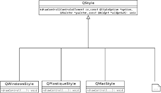
Current QStyle architecture


Additionally, if you take a look at the QStyle code, you can see a bunch of mixed code, taking care of drawing all type of widgets. Almost all the methods have a huge switch case, each taking care of an specific action of an specific widget. When someone put the eyes on it for the first time, thinks it is too complicated to understand and very messy (and indeed it is). Additionally, a code like this leads to a huge complexity to maintain and understand it.

So, why can’t each widget take care of its own features and painting? Why we could not have an interface that would define how a button is painted, for instance? Doing it this way, if we have some work to be done on the button (again the button example), it would only be done on this button class. Furthermore, if we have modifications on how the button with the plastique style, for instance, is painted, we have only to do it on the plastique button class. This approach leads to more understanding on the overall code and also makes it easy to maintain, isolating the problems that can appear, to the widget itself.

To do this, a component must be a control or composed of sub controls (such as the Slider's groove, handle and tickmarks) and for each control it'll use a QQuickItem that reads the widget's state and "paints" itself with as it is the style.

QtQuickStyles in use


We've done a few brainstorm for defining the current API to use the style in the components.
The following code is the example of how our API was thought to be used:


// Regular Button having the underneath platform look and feel
import QtQuick 2.0
import QtUiComponents 1.0

Button {
    width: 140
    height: 40
    text: "Native Button"
}


We are going to explain later how the style resolves the current platform being used.

Override platforms style:


// Regular Button having the plastique look and feel
import QtQuick 2.0
import QtUiComponents 1.0
import QtUiStyles 1.0

Button {
    width: 140
    height: 40
    text: "Plastique Button"

    // This use case is not implemented exported yet, but it will be
    style: PlastiqueButtonStyle { }
}


Using a user defined style:


// Regular Button
import QtQuick 2.0
import QtUiComponents 1.0

Button {
    width: 140
    height: 40
    text: "User-defined Button"
    // Accepts a QML Component
    style: Rectangle {
        color: "gray"
        Text {
            anchors.centerIn: parent
            text: button.text // button reference is injected when the internal Loader loads it
        }
    }
}


We can see, by the examples above that we can easily uses a Button component and gives it the look and feel that we want, by only playing around with the style property. In order to follow a well discussed and already implemented Component's API, we're using the Qt Components Common API specification for creating the components in the repository.

Custom Styles


To solve the issue of being easy to create a new style, we are also adding component helpers that exports properties that commonly changes from one application to another. These configurable properties were selected based on our experience of creating QML components.
The custom style API defined for the Button and Style can be found here.


// Regular Button
import QtQuick 2.0
import QtUiComponents 1.0

import QtUiStyles 1.0

Button {
    width: 140
    height: 40
    text: "Custom Style Button"
    style: CustomButtonStyle {
        background: "myButton.png"
        pressedBackground: "myPressedButton.png"
    }
}


ApplicationStyle API


As listed in the issues list, it's interesting that we had an easy way of setting the application theme/style in QML. We came to an API that let the developer change the style of all the components in the application that uses the default style. The example below shows how to play around with the application theme/style:


import QtQuick 2.0
import QtUiStyles 1.0

Item {
    ApplicationStyle {
        id: appStyle
        buttonStyle: CustomButtonStyle {
            background: "myButton.png"
            pressedBackground: "myPressedButton.png"
        }
    }

    Button {
        text: "Button with custom Style"
    }

    Button {
        text: "Button with plastique Style"
        style: PlastiqueButtonStyle { } // Theme changes doesn't affect when style property is set
    }

    Button {
        text: "Button with appStyle"
        style: appStyle.buttonStyle // Explicitly binds button style with a style
    }
}


Implementation Details


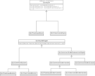
We have a global class, called QUiStyle, which (practically) has getters for each widget style who defines how it is painted. So, we would have some methods like: buttonStyle(), checkBoxStyle(), radioButtonStyle() and so on. Each specific style, e.g. Plastique, Cleanlooks, Widows, etc, will inherits from this base class and set the members that will be returned by the getters, to its specific widget style class, for instance, on the QUiPlastiqueStyle class, we will set buttonStyle member to an instance of QUiPlastiqueButton. So, it is easy for a developer to add its own Style (if he desires to make it on C++), he only has to define his new style class, inheriting from QUiStyle, and set the style widget members of QUiStyle to its own style widgets.

The following diagram can ease your understanding of the current code structure:

Proposal for a new QStyle modular architecture

For each type of widget we will have a class that calls the correct style class to paint it. For example, for the button, we have a class called QUiButtonStyle, which will ask for the QUiStyle a reference for the platform button style (calling the buttonStyle() method). Then, it will be drawn with the current platform look and feel. All the other widgets follows the same workflow.

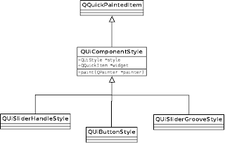
Current implementation for the style components


In order to theme your application, we have a global object called appStyle and a QML component, called ApplicationStyle (presented in the QML example above). The ApplicationStyle component as a style property for each type of widget, e.g. buttonStyle, checkBoxStyle, radioButtonStyle, etc. These properties binds to the appStyle object analogue properties. So, if you want all your buttons of your application to have a CustomButtonStyle, you can simply do it as the example.

Development Status


Currently, we are focusing on creating a good set of working widgets for the Plastique style, but we are planning to implement another style parallelly, the CleanLooks is the favourite candidate.
Now, if you take a look at our repository, you will find the following widgets:

  • Button
  • CheckBox
  • RadioButton
  • Slider

Besides this, we have a CustomStyle for each one, e.g. CustomButtonStyle, CustomCheckBoxStyle, etc. If a user does not want to use the platform look and feel or create a style from scratch, he can use this Custom API to easily create his own styles.
The next widget that is planned to be developed is the ComboBox, also with his Custom Style.

Remarks


This first release was done using the QPainter to paint the widgets, instead of using the new SceneGraph. This was done in order to speed up our development and have a nice set of widgets working as fast as possible. In the future (close future) we will get rid of all QPainter based classes and replace them to use SceneGraph. The current custom styles already does that, but we would like to have them working for the platform styles as well, and we are already researching it.

The code in repository is mess because we are still doing a lot of changes, but we need to make it make it more stable and follow the Qt addons repository architecture until the end of the month. If you have any opinion, doubt or suggestion, please let us know.

Mar 8, 2012

Qt, KDE & Akademy 2012 Event Guide Application

I've been away from KDE activities from a time, because I was organizing a lot of stuff in my life. Happily I've finally arranged some time to hack more on the weekends. I'll try to keep up the work with the Plasma Components documentation, because I think it can be improved a lot. I will also try to come up with a few examples inside the documentation, to make easier for plasmoid developers.

Another long term goal for this year, which I already started to investigate, is how to optimize  Qt Components for more about the Qt QML Components, beyond Plasma, and I'm already investigating how can we do proper styling for Qt5.

In another thread, I'm also having a great experience by working with Nuno in an application for the Akademy 2012, at Tallinn, Estonia. The application it's basically a guide for the event, with essential information about it. It will also include a programme which will alert you about the presentations you want to attend to. And it's being such a great experience to share ideas with him!

Here are some snapshots of the app:


If you want to check it yourself, just clone the git repository for the app: git@git.kde.org:scratch/pinheiro/akademy2012

Jan 4, 2012

Cropping mp3 files with FFmpeg


Today, I was trying to find a free app for cropping a mp3 sound file. And I found a simple one with CLI. The FFmpeg is a multimedia files handler and it is pretty complex. But to do this task we will use the following parameters:
  • -t chop after specified number of seconds
  • -ss chop until specified number of seconds
  • -acodec copy to maintain encoding and sampling rate
  • -i use file as input file
And the final command was something like this:

ffmpeg -acodec copy -y -t $start_at -ss $ends-at -i $inputfile.mp3 $outputfile.mp3

Oct 6, 2011

Manifesto CodeCereal


Venho recebendo diversas críticas, de várias pessoas, que deixam de ler meus posts porquê são em inglês, além de tratar de "assuntos complicados". O fato é que eu estou deixando de divulgar muita coisa que faço e está em português e não tenho tempo para fazer a tradução de tudo, devido meu recurso finito de tempo. Também gosto de escrever em inglês como forma de exercício, além de dar uma maior dispersão dos posts. Portanto decidí tomara a decisão de tornar este blog híbrido onde quando possível farei posts em inglês, mas aproveitarei o meu material escrito em português, que caso contrário ficaria arquivado. Também continuarei a compartilhar o que for relativo a inteligência artificial no AIMotion e começarei a divulgar os posts relativos ao Qt aqui e no Qt Labs Brasil.

Espero que dê certo.